Project Overview:
In this case study, we will give more insight into the redesign and modernization of the mobile app for Borrow. The major goal of this design refresh was to improve the user experience, and increase customer engagement.
Duration: January 2022 – December 2022
Responsibilities: Research, personas, wireframes, design, prototype
Tools: XD, Photoshop, illustrator, After Effects , Premiere pro
Responsibilities: Research, personas, wireframes, design, prototype
Tools: XD, Photoshop, illustrator, After Effects , Premiere pro
Introduction
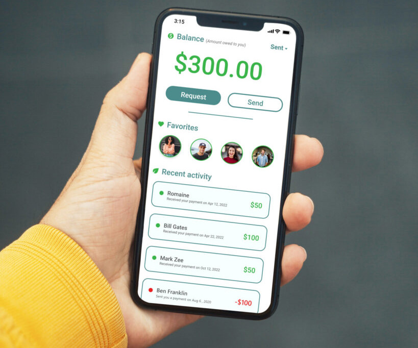
A financial technology startup wanted to redesign their mobile app to better appeal to their audience. Borrow: a cash app that provides a hassle-free and secure way to send and borrow money from families and friends.
This case study will cover the research, design process, and implementation of the redesign, and examine how the redesign meets the needs of the target audience and stakeholders. By understanding the challenges and opportunities of designing a cash app, we were able create a better digital payment experience for users.
Research
For this case study, we leaned heavily on earlier research collected during the development of the Borrow app. While this was a good starting point, we needed more up to date research, insight and data on our targeted audience.
We conducted user research on our user base to understand the financial habits and attitudes of millennials. The team used surveys, focus groups, and interviews to gather information about our audience’s banking preferences, their attitudes towards money, and the challenges they face when using the app.
While conducting research we also took a closer look at the competition, especially market leaders. We took note of existing cash apps to understand what features were most popular among users, and what they have come to expect of a financial application.
Borrow’s analytics data was use to identify user behavior patterns and pain points. Through this process, we identified the following key issues:
• Confusing navigation and/or information architecture
• Limited search functionality
• Inconsistent visual design and branding elements
• Slow loading times
With these key issues identified, the team had a clear goal for the problems we were solving.
User Persona
Based on the data collected from our research, we created a user persona – a representation of our target audience. Our user persona is Stacey, Stacey is a recent college graduate who is just starting her career in marketing. Stacey lives in a large city and relies heavily on her smartphone to manage her busy lifestyle.
Stacey values convenience and simplicity and is looking for an easy-to-use app that can help her manage her finances. Stacey wants to be able to send and receive money easily, pay her bills, and track her spending.
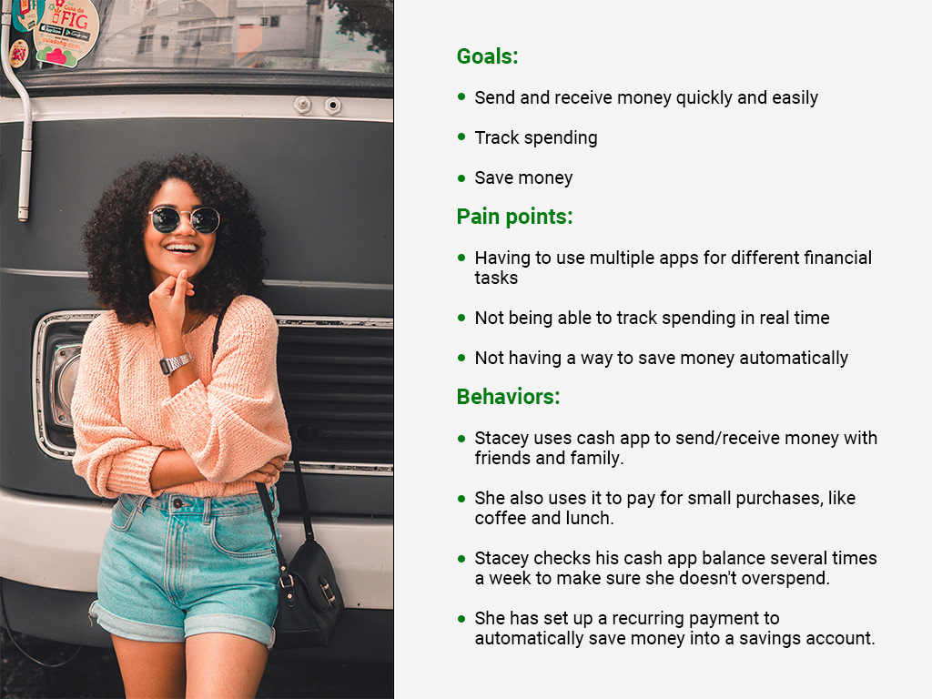
Motivations and Frustrations
Stacey is motivated by efficiency and control over her finances. She wants to be able to manage her finances quickly and easily without having to deal with complicated financial systems. Stacey is often frustrated by the uncertainty of not getting repaid when money is lent out, and dealing with hidden fees that can eat into her income, making it difficult to manage her finances.
Design
Based on our research, we developed a set of design goals for the new app, which included:
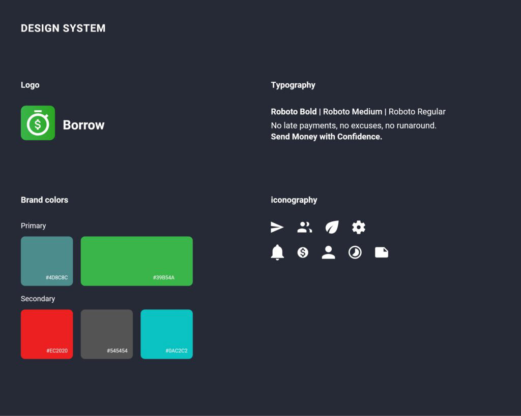
• Introduce new visual refresh and brand elements
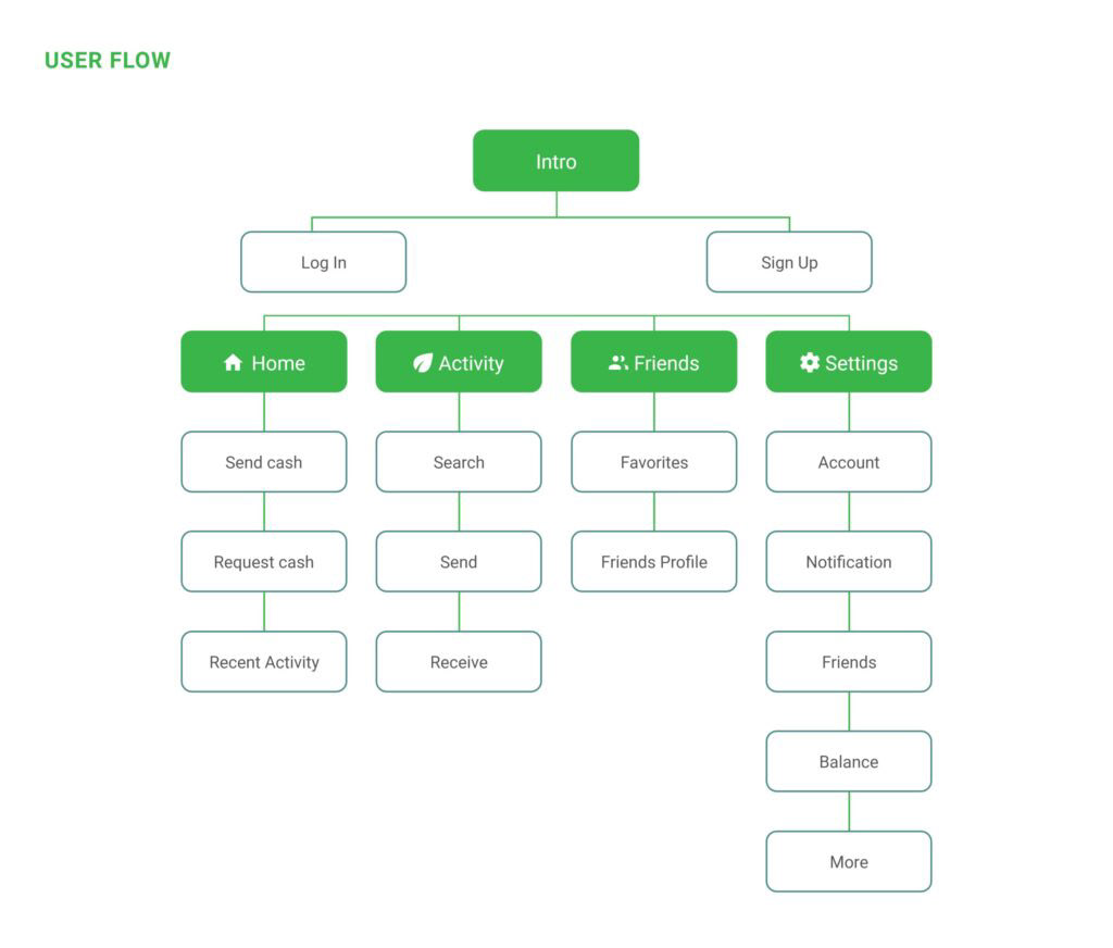
• Streamlined navigation and information architecture
• Enhanced search functionality
• Consistent visual design and branding
• Faster loading times
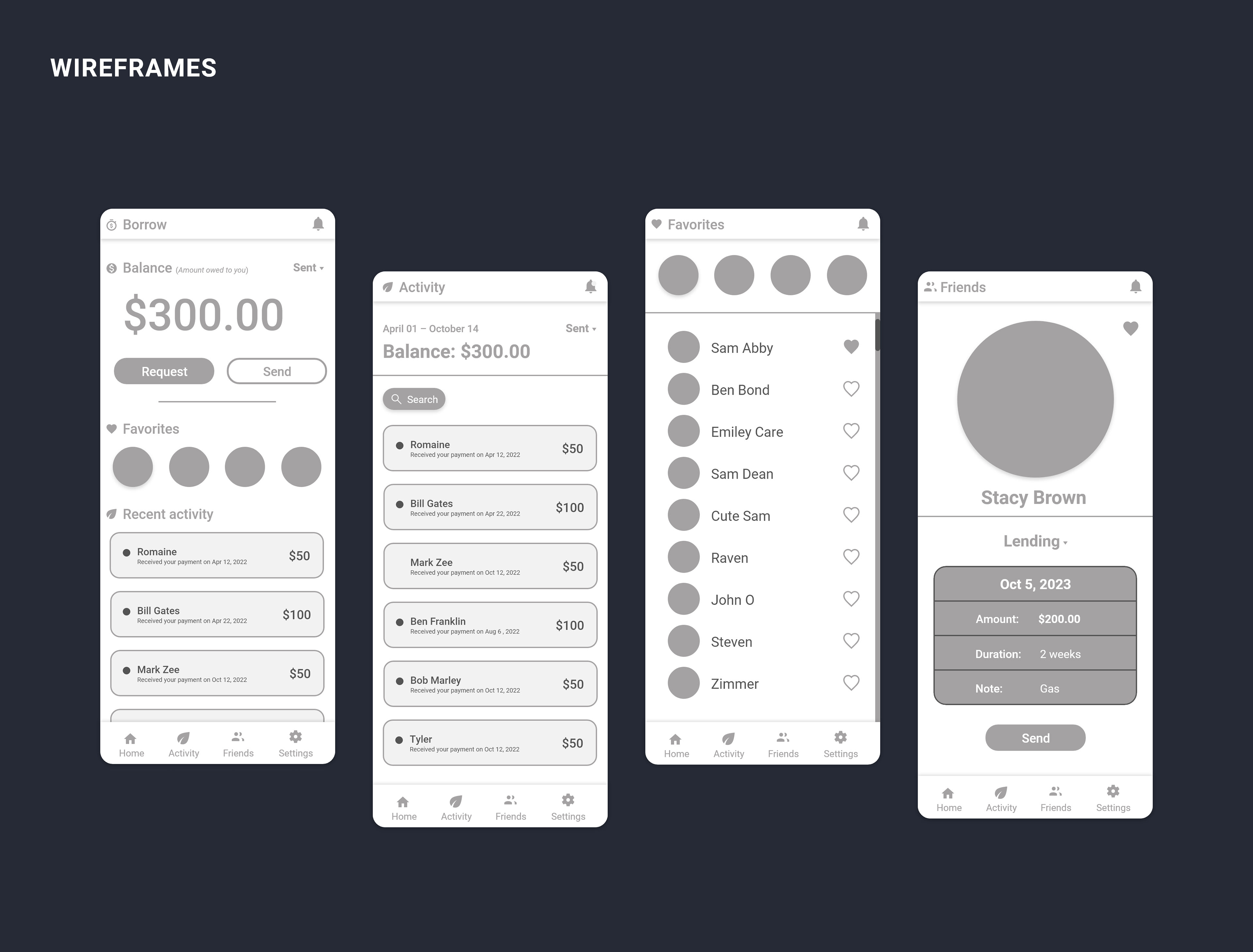
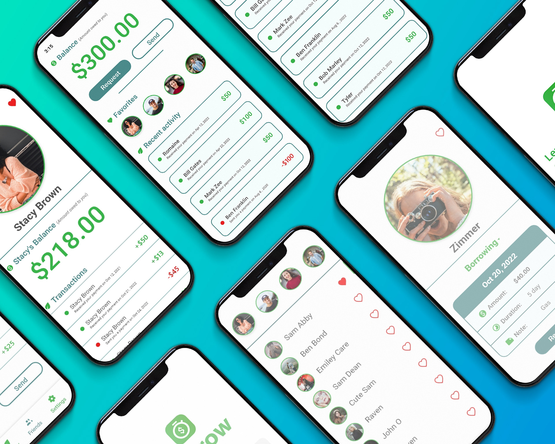
Wireframes were created using these goals as our main design tenets. Once happy with the wireframe’s structure and flow, we started to produce a high-fidelity design. Once approved, brand elements and styling started to be applied to the wireframes.
When the initial designs were completed, we begin to iterate on them based on a combination of the team’s feedback, internal usability testing, and stakeholder concerns. This process played a crucial role in developing the look, feel, and user experience of the application.
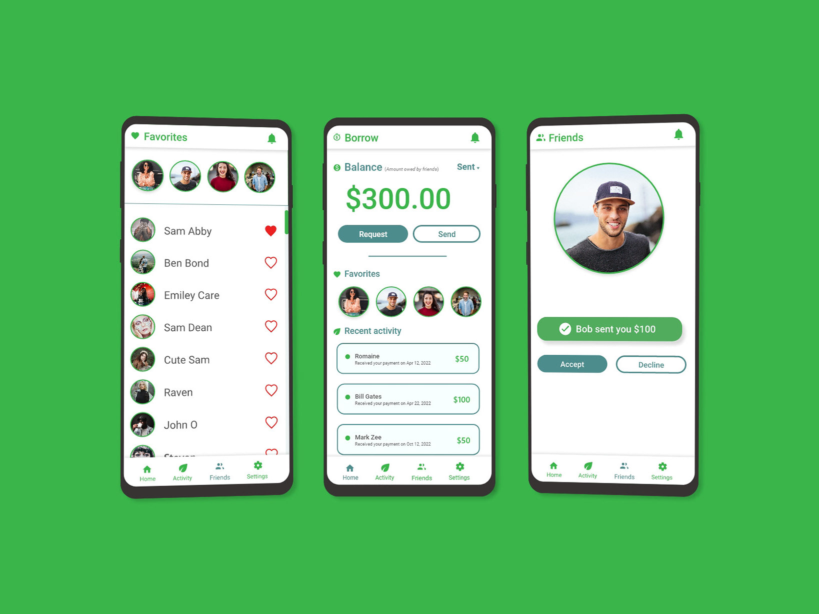
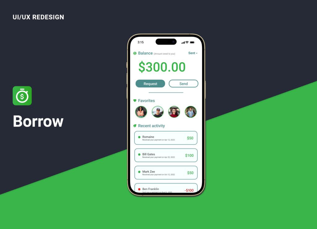
Key Features
The app’s key features included:
• Send and Receive Money
• Guaranteed repaid after a set duration of time
• Secure and fast transactions
Implementation
With an approved layout from our client influenced by our research, we worked closely with the development team for the reimagining of the app. We ensure new features were incorporated as the team had envisioned.
After we implemented our new redesign, we conducted rigorous testing user experience (UX), and quality assure (QA) testing to ensure that the new application met our design goals and our user’s standards of responsive and modern functionality.
Results
After launching the newly redesigned app, we saw a notably increase in customer engagement and satisfaction during a fiscal quarter compared to the same period the previous year. User feedback and reviews were overwhelmingly positive, with most users citing the improved navigation and search functionality as the most valuable changes.
In addition. the app also saw a decrease in loading times, resulting in a faster and smoother user experience overall. The average time user spent in the app decreased by 8%, which the team hypothesize to the increase in performance and user accomplishing their intended goals quicker.
Result highlights
• Increased user engagement
• Reduce average user time
• Increase app performance
• Overly positive user reception
Case study Conclusion
Through user research, iterative designs, and rigorous testing, our team successfully improved the user experience of the Borrow app. The redesign solutions addressed key pain points noted by the users which resulted in increased customer engagement and satisfaction.
The redesign was well-received by users, making it easier for them to manage their finances, and share money with their families and friends with confidence.
The stakeholders, design and development team were happy with the outcomes and the work that went into the project. The team is continuing to monitor and analyze the app’s analytic to determine the next step in the application lifecycle and ensuring the user comes first.